How to position background image outside div with CSS
During my first week of Bootcamp @Juno College, I had an assignment where I had to create a pixel-perfect page that matches the given design. It was a beautiful landing page with a hero section that contains the title of the page and a huge background image.
It also included the mobile version of the page and as soon as I opened the file, it presented me with a small challenge: the image on the mobile version is pushed against the left edge of the viewport so that only the right half of the image is showing.

As we all know, in web development there are usually multiple ways of solving the same problem 💡, and while you can use CSS Grid to tackle the most complicated layout, I wanted to come up with a solution that is responsive and supported by more browsers, but not requiring many media queries.
This blog post will go over how to position background images outside the container using background-sizeand background-position CSS properties.
NOTE: All examples on this post are written in SASS. I like using SASS because it solves many problems including scoping, nesting, using variables inside media queries, and it gets compiled into regular CSS meaning that it does not add to the bundle size. There is also a VS Code extension that watches & compiles .scssfile for you if you are not using a bundler.
Step1: Setting up basic styles
Here are some basic HTML markup and CSS rules to set up:

You can add a background image inside the hero div by setting background-image like so:
.hero.bg {
    background-image: url(“./images/hero-burger-image.jpg");
}
…which isn’t exactly what we want. The problem is that the background-image by default tries to fill up all available space as long as the original size of the image covers it. To dig more into this behavior, let’s examine the default value of the rules associated with background-imageproperty.
// repeat when we have enough space
background-repeat: repeat;// stretch image based on original size & keep aspect ratio
background-size: auto;// place image on top left corner of the box
background-position: top left;
So without specifying values for these rules, CSS will try to render the top left part of the image based on its size while maintaining its proportion. It will also repeat images if there is enough space.
Adjusting Background Image
First, let’s set background-repeatto no-repeat;because we never want to repeat the hero image in any case. Then we can set the background-size so that we can limit the height of the image to 70% of the container height and maintain the aspect ratio by adding background-size: auto 70%;
Now we can set background-position property to position the image against the bottom left corner of the container:
background-position: bottom left;Text Alignment
Before we address the issue of moving the image out of the container, let’s briefly align our title text first. Based on our design, it needs to be aligned to the right on the mobile screen with some top padding. On a wider screen, we need to center the title vertically while making it start horizontally around 50% of the hero section like this:

Here’s our code so far including the text alignment:
Positioning Background Image with Negative Value
Now back to our mobile view, we need to re-position the background image giving more space to the right side of the image and keep our designer happy. How can we do that? We can use a negative positioning value to “overflow” the background image outside the containing div!
// adjust the negative value according to how far
// you need to overflow the image
background-position: -100px bottom;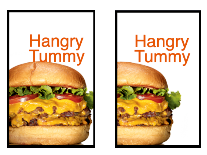
One small problem with this approach is that the left part of the image will stay hidden inside the wider viewport unless you override it with a media query. This could be undesirable for larger devices like tablets and desktops, leaving too much space between the image and the title.
We can work around this problem with a bit of math (sorry), and also note that we’re capitalizing Min()function to prevent Sass from using its own min() which cannot parse dynamic units like vw and % because they are computed inside the browser during runtime.
background-position: Min(0px, calc(100vw - 450px)) bottom;min(0px, calc(100vw — 450px)) is basically the same as saying:
- Until the viewport width reaches 450px, we’ll use the difference between 450px and the current viewport width to move the image to the left.
- When the viewport becomes greater than 450px, the difference will become a positive value, pushing the image away from the left end of the containing box.
- So when the current viewport width becomes greater than 450px, use 0px to move the image (= don’t move the image at all) effectively anchoring the image to the left.
Final Step: Resize image inside a media query
The remaining final touch would be to increase the height of the background image on a larger screen as shown in the initial design. To do this, we can simply override the background-size rule inside the media query we already have. Also, you can adjust the breakpoint (min-width value inside media query) to optimize responsiveness.
You can check out the final code in this CodePen:
Conclusion
If you want to use a background image for purely decorative purposes, using CSS background-imagecan be a good way to remove the unsemantic image element from our HTML. As discussed in this post, you can “overflow” the background image outside the containing element and still keep your page responsive. Finally, I would like to thank Juno College for allowing me to use their beautiful design for this blog post. Hope you found this article useful, and if you did, please leave many 👏👏👏👏👏 (you can clap up to 50x 😉)
